
A colored contact lens display should do more than hold products. It should help customers notice the right styles, understand the differences between collections, and make a purchase decision without feeling overwhelmed.
Many beauty shops and small retailers make the same mistake: they place every available SKU on the same shelf. The result may look well stocked, but customers often struggle to understand where to start.
A stronger colored contact lens display uses clear product groups, visible best sellers, and a simple shopping path. This is especially important for beauty shops, optical stores, and new resellers working with a limited starter inventory.
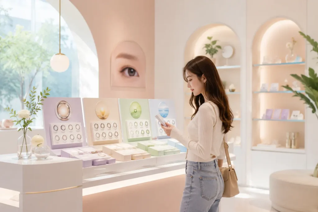
Start With Best Sellers, Not Your Full Inventory
The most visible part of your contact lens retail display should contain products that are easiest to understand and most likely to sell.
This usually includes:
- Natural brown and gray styles
- Popular big-eye styles
- Everyday wearable designs
- A small number of proven Standout Styles
- New arrivals with strong visual appeal
Best-selling contact lenses should normally appear at eye level or near the center of the display. Slow-moving products can remain available without occupying the most valuable retail space.
A crowded shelf does not automatically communicate variety. In many cases, it simply increases decision fatigue.
Your goal is not to show everything at once. Your goal is to make the first decision easy.
Organize Products Around Customer Shopping Behavior
Customers rarely shop by SKU code. They usually think in terms of appearance, occasion, replacement cycle, or expected effect.
That means your colored contact lens display should reflect how people actually shop.
Useful product sections may include:
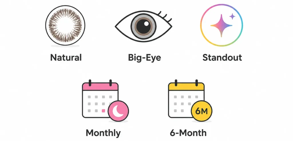
Natural Styles
Place natural brown, gray, and subtle enhancement lenses together. These products often serve customers looking for everyday wear or a low-risk first purchase.
Big-Eye Styles
Give enlargement styles their own section instead of mixing them with subtle natural lenses. This helps customers immediately recognize the intended visual effect.
Standout Styles
Blue, green, violet, and multitone lenses often create a more noticeable transformation than natural styles. Their appeal comes from stronger color contrast, layered patterns, and a more defined or mixed-heritage-inspired look—not from the enlarged, doll-like effect associated with big-eye lenses.
Keep this section visually separate from both natural and big-eye collections so customers can quickly understand the difference:
Standout styles: visible color transformation, depth, and contrast
Natural styles: subtle, native-eye appearance
Big-eye styles: enlarged, rounder doll-eye effect
Monthly and 6-Month Lenses
Separate products by replacement cycle when customers need to compare usage periods and purchasing value. Mixing them without clear labeling can create confusion.
New Arrivals
A small “New Arrival” area gives returning customers a reason to look again. It also gives store staff an easy conversation starter.
Use Visual Merchandising to Guide Attention
Good contact lens merchandising controls where customers look first.
A simple display hierarchy can work better than a large decorative installation.
| Display area | Recommended products | Main purpose |
|---|---|---|
| Eye level | Proven best sellers | Capture immediate attention |
| Center section | Natural everyday styles | Support broad demand |
| Side section | standout and high-impact styles | Encourage discovery |
| Counter area | New arrivals or staff picks | Start conversations |
| Lower section | Additional colors or backup stock | Expand choice without clutter |
Several basic principles improve product visibility:
- Keep the display clean and well spaced.
- Use consistent product orientation.
- Group visually similar collections together.
- Avoid placing too many nearly identical colors side by side.
- Use one clear label for each section.
- Make featured products easier to reach and inspect.
- Keep empty spaces intentional rather than filling every gap.
White space is useful in retail merchandising. It separates product groups and signals which products deserve attention.
Create Small Collections Instead of Showing Isolated Products
Individual products are harder to understand when customers have no context.
A collection gives the customer a reason to compare several styles within one clear idea.
Examples include:
- Natural Starter Collection
- Everyday Brown Collection
- Gray Best Sellers
- Big-Eye Favorites
- TikTok-Inspired Styles
- New Season Colors
- Monthly Everyday Lenses
- 6-Month Value Collection
These collections can also support staff recommendations.
Instead of asking a customer to choose from dozens of unrelated products, a salesperson can begin with a simpler question:
Are you looking for a natural everyday effect or a more noticeable style?
The display then supports the conversation by showing the relevant section immediately.
Rotate the Display Instead of Constantly Expanding It
A retail display should change even when your total inventory stays the same.
Regular rotation keeps the shelf visually fresh and helps you learn which products attract attention.
A practical rotation schedule might include:
Weekly
- Replace one underperforming featured product
- Move a strong seller into a more visible position
- Update staff recommendations
Monthly
- Refresh the new-arrival section
- Review which color groups received the most interest
- Reduce space assigned to slow-moving styles
Seasonally
- Highlight colors connected to holidays, events, or local beauty trends
- Create a temporary social-media collection
- Adjust natural versus statement styles based on customer demand
Rotation gives you information. It helps distinguish products that are weak from products that were simply displayed poorly.
Match the Display to the Sales Channel
The best contact lens store layout depends on where and how customers buy.
Beauty Shops
Beauty shop contact lens displays should feel easy, visual, and style-oriented.
Prioritize:
- Natural collections
- Best-selling brown and gray styles
- Big-eye effects
- New arrivals
- Easy visual comparisons
Optical Stores
Optical stores may need a clearer distinction between:
- Replacement cycles
- Prescription availability
- Natural versus cosmetic effects
- Product information and compliance materials
The display can still be attractive, but clarity and professional trust should remain visible.
Social-Selling or Livestream Corners
Stores selling through TikTok, Shopee, Lazada, or livestreams may benefit from a smaller display designed for content creation.
This area can feature:
- High-contrast packaging
- Standout Styles
- Coordinated collections
- New arrivals
- Styles with strong on-eye visual differences
A social-selling display does not need to represent the full inventory. It needs to present products clearly on camera.
Avoid These Common Display Mistakes
Even a well-selected product range can underperform when the display creates friction.
Common mistakes include:
- Showing too many products on one shelf
- Organizing only by internal SKU number
- Hiding best sellers among slow-moving products
- Mixing monthly and 6-month lenses without clear labels
- Using too many signs or long product descriptions
- Failing to separate natural and statement styles
- Leaving the same arrangement unchanged for months
- Giving every product equal visual priority
- Placing new arrivals where customers cannot notice them
- Using personal preference instead of sales behavior to decide placement
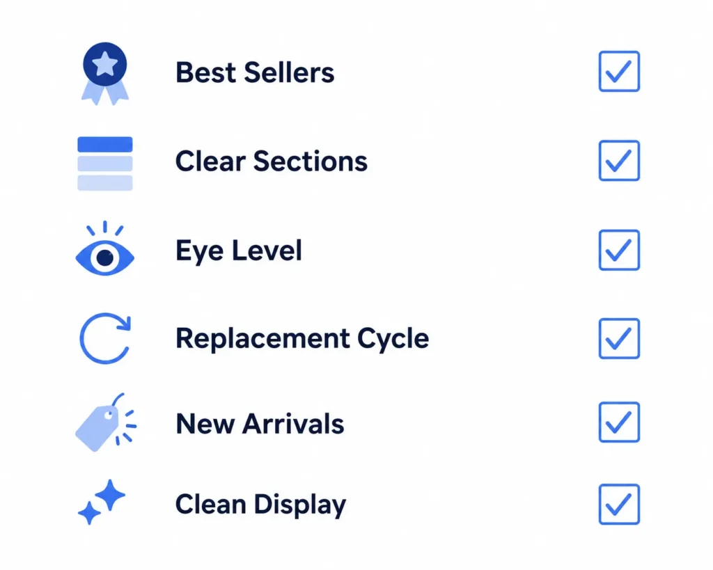
Use Sales Data to Improve the Display
A colored contact lens display should not remain based on guesswork.
Track simple signals such as:
- Which section customers visit first
- Which products they ask to see
- Which styles sell after being moved to eye level
- Which colors receive attention but not purchases
- Which collections produce repeat sales
- Which products perform better during livestreams or social campaigns
You do not need complex software to begin.
A basic monthly review can compare:
- Display position
- Customer questions
- Units sold
- Repeat orders
- Slow-moving stock
This helps you decide whether a product needs better placement, clearer grouping, or removal from the featured area.
A Small Inventory Can Still Create a Strong Display
A store does not need hundreds of SKUs to create an effective presentation.
A focused starter assortment can be divided into a few clear product stories:
- Natural daily sellers
- Big-eye favorites
- Standout styles for visible transformation
- Monthly options
- 6-month options
- New arrivals
This is one reason new resellers should plan their first order around a balanced SKU mix rather than ordering too many similar products.
A smaller, better-organized display often looks more intentional than a large shelf filled without hierarchy.
For sellers still building their assortment, the guides on choosing your first lens styles and preparing your first wholesale order can help connect inventory planning with retail presentation.
Before thinking about store displays, make sure your first wholesale order is built around a practical inventory plan. Our First Wholesale Order Checklist for Colored Contact Lens Sellers explains how to prepare a balanced first order without unnecessary stock pressure.
Build a Store-Friendly Collection With UYAAI
UYAAI supports beauty shops, optical stores, ecommerce sellers, and qualified resellers building colored contact lens collections for Southeast Asian markets.
With a minimum order of 100 pairs and a minimum of 5 pairs per SKU, new sellers can test several product groups without committing too deeply to one style. The wholesale catalog includes natural colors, big-eye designs, standout styles, monthly lenses, and 6-month lenses that can be organized into clear store collections.
Before expanding your display, start with products that serve a specific customer need and can be restocked based on real sales.
View the UYAAI Wholesale Catalog to plan a store-friendly assortment, or submit a wholesale inquiry with your country, sales channel, and target order quantity.