
A colored contact lens product page can have good photography, complete specifications, and detailed descriptions—and still leave customers unsure what to buy.
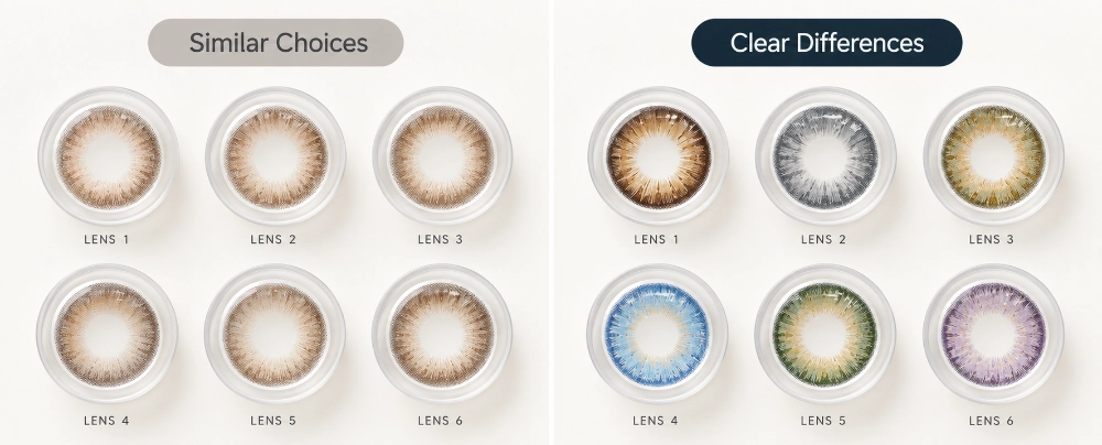
This happens most often when several products look similar.
A seller may offer Coffee Brown, Mocha Brown, Cocoa Brown, and Hazel Brown. Every SKU has its own image, name, and description. From the seller’s perspective, the assortment is organized.
From the customer’s perspective, the question may still be:
What is actually different about these four?
The problem is not always a lack of information.
It is often a lack of decision information.
Many ecommerce pages are built around:
What can we tell customers about this product?
A more useful question is:
What does the customer need to understand before choosing this product instead of another one?
That distinction matters for colored contact lenses because buyers are usually trying to predict a visual result.
Will the lens look natural?
Will it make the eyes appear larger?
Is the gray subtle or obvious?
How different is this brown from the one beside it?
A good product page helps answer those questions before asking the customer to process more information.
Start with the Questions Customers Keep Asking
One of the easiest ways to diagnose a weak product page is to stop looking at the page for a moment.
Look at the questions around it.
Check:
- marketplace chat;
- WhatsApp conversations;
- product Q&A;
- store staff feedback;
- social media comments;
- direct messages.
Repeated questions often reveal where the customer’s decision is slowing down.
| Repeated Customer Question | What the Page May Be Missing |
|---|---|
| Which one looks more natural? | Clear visual role |
| Which makes the eyes look bigger? | Enlargement difference |
| Which brown is lighter? | Relative color comparison |
| Is this monthly or half-year? | Visible replacement-cycle information |
| Does it come in my power? | Easy-to-find prescription availability |
Not every repeated question should become another FAQ.
If customers regularly ask:
Which of these two brown lenses looks more natural?
adding that exact question to an FAQ may only hide the problem deeper in the page.
The more important question is why the customer could not understand the difference from the main product presentation.
This is similar to physical merchandising. A good store display helps shoppers understand product differences before they need a staff member to explain every SKU individually. The same thinking applies online, which is why How to Display Colored Contact Lenses to Increase Store Sales is also relevant to ecommerce merchandising.
Repeated customer questions are not just support workload.
They are page-diagnostic data.
Similar Products Need Relative Differences
Product names identify SKUs.
They do not necessarily help customers compare them.
Consider four fictional product names:
- Coffee Brown
- Mocha Brown
- Cocoa Brown
- Caramel Brown
All four sound appropriate.
But they do not tell a first-time shopper:
- which is subtler;
- which is warmer;
- which enlarges more;
- which has a stronger visible pattern;
- which works better for someone wanting an everyday look.
A longer description for each SKU may not solve this.
You can easily end up with four paragraphs that all say some version of:
A beautiful brown lens designed for a natural and attractive eye look.
Each description sounds acceptable.
Together, they still give the shopper very little basis for choosing.
When two products compete for the same customer decision, the difference between them is often more useful than two separate descriptions.
For example:
| Brown A | Brown B | |
|---|---|---|
| Overall Effect | Subtle | More visible |
| Enlargement | Low | Medium |
| Tone | Warm | Neutral |
| Best Fit | Everyday | More noticeable look |
These are illustrative dimensions, not specifications for actual UYAAI products.
The point is that sellers need to understand what role each SKU plays before they can translate that difference into customer-facing language.
That is where How to Build a Balanced Colored Contact Lens Collection That Actually Sells becomes useful. An assortment may intentionally include Natural, Big Eye, Soft Glam, Soft Hybrid, Bold Hybrid, K-Beauty, and other directions because those products serve different visual roles.
The product page is where those assortment differences have to become understandable.
Without that translation, the seller may have a strategically balanced collection that still looks like a wall of similar products to the customer.
One Image Should Not Be Asked to Answer Every Question
“Use high-quality product photos” is not enough.
The more useful question is:
What is this image helping the customer understand?
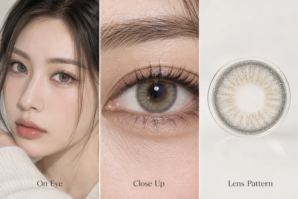
A full on-eye image may show the overall effect very well, but hide the pattern.
A close-up can reveal the limbal ring, edge definition, and enlargement more clearly.
A lens-only image can show the graphic structure but cannot tell the customer how the design behaves on a real eye.
Each visual has a different job.
On-Eye Image
Use it to answer:
What does the overall result look like when worn?
Close-Up Eye Image
Use it when the customer needs to judge details such as pattern visibility, edge definition, or enlargement.
Lens Pattern Image
Use it to show the design structure itself.
Comparison Image
Use it selectively when two SKUs are genuinely difficult to distinguish.
The objective is not to add every image type to every product.
It is to avoid forcing one attractive photo to carry the entire decision.
Specifications Should Confirm the Choice, Not Hide the Product
Colored contact lens pages also need practical product information.
Depending on the product and market, customers may need to confirm:
- available powers;
- replacement cycle;
- diameter;
- graphic diameter;
- base curve;
- material;
- water content;
- other relevant specifications.
The issue is not whether this information belongs on the page.
It does.
The issue is whether it is given the right priority.
Imagine a mobile shopper opening a product page and seeing:
product title
→ SKU code
→ diameter
→ base curve
→ water content
→ material
→ several promotional sentences
before clearly seeing what the lens actually looks like.
The page may be complete.
The decision path is not.
For many colored lens shoppers, the first question is visual:
Is this the kind of look I want?
Then they confirm practical purchasing conditions:
Is my power available?
What is the replacement cycle?
So the page has to support both stages.
Choice information helps the shopper understand the visual difference.
Purchase-confirmation information helps confirm that the chosen product is appropriate and available.
Important information should remain easy to find.
It simply does not all need to compete for the first position.
A Hypothetical Seller Case: 18 SKUs and the Wrong Kind of Questions
The following scenario is hypothetical and is used only to illustrate the merchandising problem.
Consider a Southeast Asian ecommerce seller carrying 18 colored contact lens SKUs.
The assortment includes several brown styles, several gray styles, two Big Eye directions, and a few stronger visual-effect products.
Traffic is not the problem.
Customers are reaching the listings.
The seller also has decent product photography and complete basic specifications.
But customer service repeatedly receives:
Which brown is the most natural?
Is Gray 03 lighter than Gray 05?
Which one enlarges the eyes more?
What’s the difference between these two?
Which one should I choose for everyday wear?
The seller assumes customers need more information.
Descriptions become longer.
Specifications become more prominent.
Each SKU receives additional promotional copy.
The questions barely change.
The missing information was not more product description.
It was relative difference.
So the seller changes the page without adding new SKUs or rebuilding the entire store.
On-eye imagery moves earlier.
Similar brown products become easier to compare.
Subtle and more visible styles are presented more distinctly.
Replacement cycle and prescription availability remain easy to find, but no longer dominate the first screen.
Two gray SKUs that caused frequent confusion receive a direct side-by-side comparison.
The mobile page also becomes less crowded at the top.
The useful change is not that customer questions disappear.
The questions move.
Before:
Which one should I choose?
After the product differences become clearer:
Does this one come in -3.00?
That second question still requires an answer.
But the customer has already completed most of the style decision.
A better product page does not eliminate customer questions. It moves them closer to purchase.
Mobile Pages Reveal Weak Information Priority Faster
Mobile pages make poor information hierarchy easier to see.
That matters for sellers using Shopee, Lazada, TikTok Shop, or their own mobile-first ecommerce sites.
Screen space is limited.
If the first two screens are dominated by a long title, internal SKU codes, generic promotional copy, and secondary specifications—but the shopper still cannot tell whether the lens is subtle or bold—the page is using its most valuable space poorly.
A useful test is simple:
After two screens of scrolling, does the customer understand the basic visual role of the lens?
If not, the problem may be information priority rather than information quantity.
This connects directly with How to Sell Colored Contact Lenses on Shopee, Lazada, and TikTok Shop Without Competing Only on Price.
When several marketplace products appear interchangeable, price becomes one of the easiest remaining comparison signals.
Clear visual positioning gives the customer something else to compare.
Do Not Add More SKUs to Fix an Unclear Assortment
When a product page does not perform well, sellers sometimes respond by adding more choices.
Maybe 18 SKUs are not enough.
So 18 becomes 25.
Then 25 becomes 35.
But if the original 18 were already difficult to distinguish, expanding the assortment may increase choice without improving understanding.
Assortment size and assortment clarity are different problems.
A wider range can absolutely be useful. It can cover more style preferences, visual effects, replacement cycles, and selling scenarios.
But the value of that width depends on whether customers understand why those products are different.
That is why product selection and product presentation should work together.
How to Choose Your First 10 Lens Styles Without Overstocking helps sellers decide which products deserve a place in an opening assortment.
The next job is to present those products clearly enough for the market to respond.
Then sales data becomes meaningful.
How to Use Sales Data to Decide Which Colored Contact Lens Styles to Restock addresses what happens after customers begin choosing: which SKUs deserve deeper inventory, which should be monitored, and which may not justify the same stock commitment.
If presentation is unclear, however, poor sales can become harder to interpret.
Was the SKU genuinely weak?
Or did customers never understand why they should choose it?
That is another reason assortment clarity matters before expanding the range.
A Product Page Should Help Customers Eliminate Options
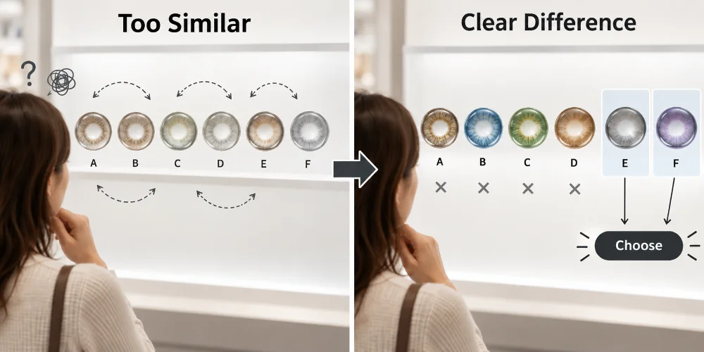
Customers do not always enter a colored contact lens page knowing exactly which SKU they want.
They narrow the field.
One product is too bold.
Another is too subtle.
One enlarges more than they prefer.
Another has the right visual effect but not the required prescription power.
A different replacement cycle may fit their preference better.
Eventually, the shopper is no longer comparing ten products.
They are comparing two.
Then one.
That is what good product merchandising helps accomplish.
A product page is not simply a place to store everything the seller knows about a SKU.
Its job is to organize product information in the order the customer needs it to make a decision.
For UYAAI distributors, resellers, beauty shops, and ecommerce sellers, the wholesale catalog can help establish an assortment across Natural, Big Eye, Soft Glam, hybrid, K-Beauty, and other colored lens directions. UYAAI’s current branded-wholesale positioning is built around flexible assortment planning for Southeast Asian distribution and retail channels.
Once those products reach the retail page, however, the seller still has one more job:
make the differences easy enough for customers to use.
View the UYAAI Wholesale Catalog to compare colored contact lens style directions for your assortment.
If you are planning a new wholesale selection or expanding an existing range, Submit a Wholesale Inquiry with your market, sales channel, and product direction so the discussion can start from the assortment you actually need.